 User Interface: Label Design
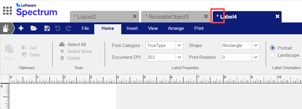
Use Label Design
Views and Document Information
A label template A digital representation of a label that can be combined with variable data and used by print jobs to generate print job details. or a reusable object includes both the Label view and Form view of the label template. You can switch between the views using the Label View and Form View buttons at the right side of the ribbon. When a layer object is open, you see only a Label view. Forms that are not associated with a label template must be managed in Application Design
- The Label view of a label template, reusable object, or layer object shows the design for printed labels produced from a label template and optionally allows you to associate a layout with the label template.
- The Form view of a label template or reusable object shows the design for data entry forms produced from a label template. If a user acting as a Data Provider Person or process that enters data into a form or other data entry view for a label that was configured by a Designer. A user acting as a Data Provider requires the DOCUMENT_PRINTER role or equivalent permissions. enters data in Print

Note: The impact of character-level formatting is not displayed in Label Design
A layout An object that defines an organizational structure for printing multiple labels by using one or more label templates. has only one view, which shows the reference areas for labels on a page In relation to media, the organization of labels specified by a layout. In relation to the Loftware user interface, a top-level tab..
The following information is displayed.
Ribbon Commands
New (+) Menu
| Command | Description |
|---|---|
|
Label |
Create and open a label template so that you can configure properties for a printed label, such as the height and width. |
|
Layout |
Create and open a layout |
|
Layer |
|
|
Image |
Import a new image into the Loftware Enterprise SP library so that it can be used in label templates. Note: An image that will be used only as part of a Variable Image may be saved to any folder in Loftware Enterprise SP. Otherwise, for an image to be available to add to a label template, you must save it to the Images\User Images folder, the Images\Stock Images folder, or a subfolder of one of those folders. |
|
Reusable Object |
Create and open a reusable object. As with a label template, you can add fields to a reusable object and save it. You can add content from a reusable object to label templates, forms, or reusable objects. |
|
Field Data Catalog |
Ribbon Commands
|
Icon |
Command |
Description |
|---|---|---|

|
New |
Create a new object of a specific type. |
|
|
Open |
Open an existing object. |
|
|
Save |
Save the displayed object. |
|
|
Undo Edits |
Reverse the most recent action on an object. |
|
|
Redo |
Reapply the previously undone action to an object. |


 File Menu
|
Command |
Description |
|---|---|
|
Open |
Open an existing object. |
|
Close |
Close the current object. |
|
Close All |
Close all objects that you have open. |
|
Save |
Save the object. |
|
Save As |
Save a copy of the object under a different name. |
|
Import |
Import an object that was previously exported to a separate file outside of Loftware Enterprise SP. |
|
Export |
Export an object to a separate file outside of Loftware Enterprise SP. Tip: You can use this capability to transfer an object from one instance of Loftware Enterprise SP to another. Tip: If your organization has separate Loftware Application Servers for different phases of development (such as development, quality assurance, user acceptance testing, and production), object promotion |
Workflow
| Command | Description |
|---|---|
| Start Workflow |
Open the Select a Workflow Template dialog box, which allows you to select a workflow for tracking and managing modifications to the label template or layer object. |
| View Current Step Details |
View the details of the current step of the workflow that the label template or layer object is in. |
Version Control
The following commands are available only for objects that are version controlled The following types of objects are version controlled when saved in a version-controlled folder: label templates, forms, images, layer objects, layouts, reusable objects, field data catalogs, applications, business rules, processes, workflow templates, and data services. Images do not support minor versions..
|
Command |
Description |
|---|---|
|
Check In |
Save the current version of the object and make this the object available for publishing or for others to check out. Checking in creates a version that can no longer be altered. Available only to the user who checked out or has taken control of the object. |
|
Check Out |
Create a new, editable version of the object, incrementing the minor version number. Other users cannot change the object or view the version that you have created until it is checked in. Available only for an object that is checked in. |
|
Undo Check Out |
Undo any changes made since the object was most recently checked out, and then check it in. The checked out version is discarded and the version number is decremented to that of the previous version. If you took control of the object from the user who checked it out, changes made by the other user since it was last checked out are discarded. Available only to the user who checked out or has taken control of the object. |
|
Publish |
Check in and create a new published version of the object, incrementing the major version number and setting the minor version number to zero. Available only to users with Publish (PB) permission for |
|
Undo Publish |
Delete the published version WARNING: If you have already initiated a print job using the published version or have used or link to that version, you may get unexpected results. Available only to users with Publish (PB) permission for |
Switch View Commands
When viewing a label template or a reusable object, the Label View is displayed by default, but you can switch between views.
|
Icon |
Command |
Description |
|---|---|---|

|
Label View |
Display the Label View in the full window. |

|
Form View |
Display the Form View in the full window. |
Ribbon Tabs and Properties
You can use the tabs in the ribbon and the Properties pane to configure a selected object, field, or area. The tabs and the Properties pane are context sensitive, so the options displayed vary depending on the type of object displayed and the type of field selected, if any. If the Properties pane is closed, click View > Properties to display it.
When a label template, layer object, reusable object, layout, or field data catalog is displayed, the type of object is displayed in the Properties pane. When you click a field or area, its properties are displayed. You can select fields or areas by name from the Fields panel (accessible by clicking View > Fields), or you can click a field or area on the canvas to select it.
For more about the properties of objects, see the following topics:
For more about the properties of fields or areas within an object, see the following topics:
- Text Properties
- Control Properties
- Shape Properties
- Barcode Properties and Symbologies
- Image Properties
- Layer Area Properties
Tip: If you are viewing a label template that was migrated from a Loftware Print Server (LPS) environment, a  Migration Information section is displayed in the Properties panel. To display a report of all migration information for the label template, click the canvas and then click the View Messages button. For details only about a specific field in the label template, click the field and then click View Messages. Also, if LPS-Style Font Rendering was turned on when the label template was migrated, then a notice to that effect is displayed in the Properties panel. For more information, see Working with a Migrated Label Template.