Arial Font Change in Windows 10 Causes Label to Look Different
Problem
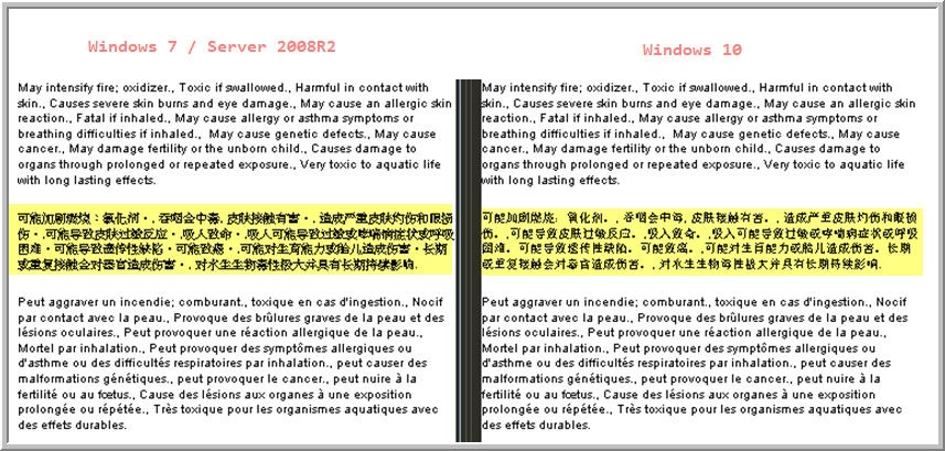
Changing Operating Systems from Windows 7 (and/or) Server 2008/Server 2008R2, to Windows 10 - Loftware Labels with Arial Font look different (are less bold).
Explanation
Microsoft has changed the look of Arial font (maybe other fonts too) when they moved from Windows 7, Windows 2008, and Windows 2008R2 to Windows 10.
Note
Server 2012 has not been tested to date to verify this difference. This font difference will most likely be seen in the upcoming Windows Server 2016 too (but untested at this point, as it is not released yet). There is also the potential for other related fonts (Arial Unicode MS for example) to be impacted, but have not been verified to date.
Comparing the same label between the Operating Systems, the Windows 7/Server 2008/Server 2008R2 font is bolder (different) than the Windows 10.
Solution
If the previous font appearance is desired, the following steps can be taken to revert the font back:
Copy the Font file(s) from the previous Operating System with the desired look, and place them in the Windows 10 operating system appropriate font folder. Then test the system thoroughly to ensure proper functionality and look by physically printing the two Operating System labels and compare their results.
Article Number
2017006
Versions
LPS is only supported on a Server based OS per Loftware's compatibility matix. So this article will only effect Loftware Label![]() A label is a design area on the computer screen where a label format is created or edited. Manager in a supported product version environment. May effect those testing LPS in a non-supported/Non-Server based Operating System.
A label is a design area on the computer screen where a label format is created or edited. Manager in a supported product version environment. May effect those testing LPS in a non-supported/Non-Server based Operating System.
Environment
Upgrading to Windows 10

