Button Group
Button Group adds a group of clickable and customizable buttons on a form. Use this object to create multiple buttons from a list of items in a single move. The created buttons allow you to set value of the connected variable, and/or execute the assigned actions.
Tip
The number of buttons in the group corresponds to the number of items (values) on the list.
Source
Connected data source is the dynamic data source that is connected with the object.
Variables variable which stores the value selected in Button Group object.
Databases database field which stores the value selected in Button Group object.
Settings
Settings tab defines object content editing specifics and displaying of values.
Allow duplicates allows duplicated values to appear in the object.
Is sorted sorts the list of elements in ascending order. Use case sensitive sort additionally determines if the letter case should affect the sorting order or not.
Values group of settings allows defining the listed elements:
Items source: defines the source for listed items.
Custom values: static user-defined values.
Installed printers: list of installed printers.
Database field: retrieved values from a connected database.
Field: selection of connected database field to retrieve the content from.
Use another field for connected data source option: connects another database field to the connected data source. Field values are still shown, but the connected data source receives the selected value from a field which is specified in Value field.
Value field: selects the database field that is sent to the object's Connected data source and displayed as its content.
Example
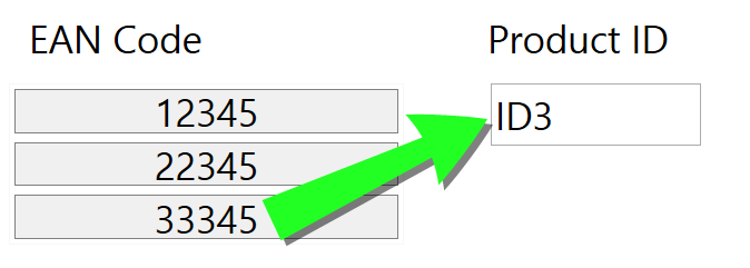
Button Group object details Items source: EAN Code
Product ID
12345
ID1
22345
ID2
33345
ID3
Text object details Added Text object should only display matching Product ID values.
Result: The selected EAN Code in Button Group results in the matching Product ID in Text object.

File names: lists all files in the selected directory.
Directory: defines the source folder for files to be listed.
File mask: specifies the filter for selecting the listed files.
Example
*.* lists all files
*.nlbl lists only files with .nlbl extension.
t*.nlbl lists files that start with "t" and have the extension .nlbl.
Show the file path: entire file path is displayed on the list.
Show the file extension: file extension visible on the list.
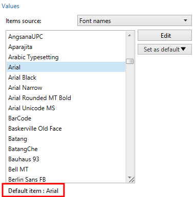
Font names: lists the installed fonts.
Labels in solutions: lists all labels within the solution.
Edit: converts other item sources into a custom values item source.
Values content list: displays the current object content.
Set as default: turns the currently active selection into a default value.
Tip
Default value is a value that is automatically selected when the form is run.

Note
All values except for custom values are populated when the form is run. The values displayed at design time are sample values retrieved from the system. After clicking the Edit, Desktop Designer makes a copy of values and makes them editable in the Custom Values dialog.
Layout group allows you to customize the appearance of Button Group object.
Button size group allows you to define width and height of individual buttons in the group.
Automatically size buttons: disable this option to set custom Width and Height values.
Button spacing group sets the distance between individual buttons in a group.
Horizontal: defines horizontal distance between buttons in a group.
Vertical: defines vertical distance between buttons in a group.
Layout group defines how the buttons are distributed when the form is run.
Orientation: allows you to stack the buttons Horizontally or Vertically.
Number of rows: sets the number of rows in which the buttons are located on the form.
Word wrap: After reaching the end of button, word wrap breaks the tag into multiple lines.
Style
Style tab defines visual appearance of an object.
Background color defines object background color.
Transparent: transparent object background.
Border color sets the color of button border.
Font color defines font and underline colors.
Font selects the typeface.
The font may appear Bold, Italic, Underlined or as a Strikethrough text.
Alignment defines horizontal positioning of the entered content.
Left: text aligned with the left button border.
Center: text positioned centrally.
Right: text aligned with the right button border.
Position
Position tab defines object positioning and its position-related behavior.
Position group defines the object position.
X and Y: anchoring point coordinates.
Width and Height: horizontal and vertical object dimension.
Keep aspect ratio: simultaneous changing of object dimensions while scaling.
Lock: prevents the object from being moved during the design process.
Size group sets how object's dimensions change when the form is running:
Resize anchor point: defines the fixed distance of an object from the form borders.
Tip
Choose the most appropriate anchor point to ensure the object's visibility regardless of the current window size.
Horizontally resize with form and Vertically resize with form: object size automatically adapts to the changing size of the form.
Horizontally resize with form: object width adapts to the resized form.
Vertically resize with form: object height adapts to the resized form.
Note
If both options are enabled, object width and height adapt to the resized form simultaneously.
Rotation angle group sets the object angle according to the design surface.
Events
Events tab defines the actions that are run by various object-related events.
Tip
See section Actions to read more about this powerful Desktop Designer tool.
Available events are:
On Click: action is run on mouse click.
General
General tab identifies the object and defines object state on form startup.
Name sets a unique object ID. It is used for object referencing when defining functions, variables, scripts, etc.
Description allows adding notes and annotations for an object.
Hint (tooltip) helps the form users by briefly explaining why or how to use an object. Hint is shown to a user when the mouse pointer floats over the selected object.
Initial state on form startup group defines the object behavior when the form is run for the first time:
Enabled: defines if the object is going to be active (editable) at form startup or not.
Condition: an object is enabled if the result of the given condition is "True".
Visible: defines if the selected object is going to appear on the form or not.
Condition: an object is visible if the result of the given condition is "True".